Your school website is one of the most important marketing tools you have when it comes to attracting and engaging prospective families. Not only does it provide a snapshot of student life, but it also showcases your brand and communicates why families should enrol at your school.
A great way to engage visitors and enrich their interaction with your website is by adding elements of animation or motion design. Strategically placing motion on your website can help guide your audience and navigate them towards key features. There’s little limitation when it comes to how motion can be utilised on your school website, from call to actions to interactive scrolling, and more!
So why use motion design? The goal here is to create a sense of participation and excitement for visitors, all while adding personality to your school website. Content that might have otherwise appeared to be repetitive is transformed into a unique and engaging experience. If we’re being honest, websites without motion often appear lifeless and lacking in personality – definitely not something you want to be associated with your school.
Now, we’re not saying that you have to go over the top with motion, there’s a balance that you need to strike to prevent it from becoming distracting or compromising your website’s usability. At Digistorm, our designers work hard to ensure that every school website is competitive and optimised for engagement.
Let’s take a look at how we apply motion with some key examples.
Micro-interactions and hover effects
As we touched on before, there are several ways that motion design can be utilised to enhance a website. One of the most effective ways to guide visitors toward the desired action is through micro-interactions. These are small animations that provide visual feedback to visitors and help to highlight actions.
A common micro-interaction that you might be familiar with is the hover effect. This is where moving a cursor over an object on your website will cause its appearance to change, indicating that the object is clickable. This could be as simple as a button changing or text appearing over an image – these micro-interactions help to engage visitors and ensure they’re taking the desired action. A key point to remember about micro-interactions is that they should be subtle. They should never draw attention away from your website content, but instead, amplify it.
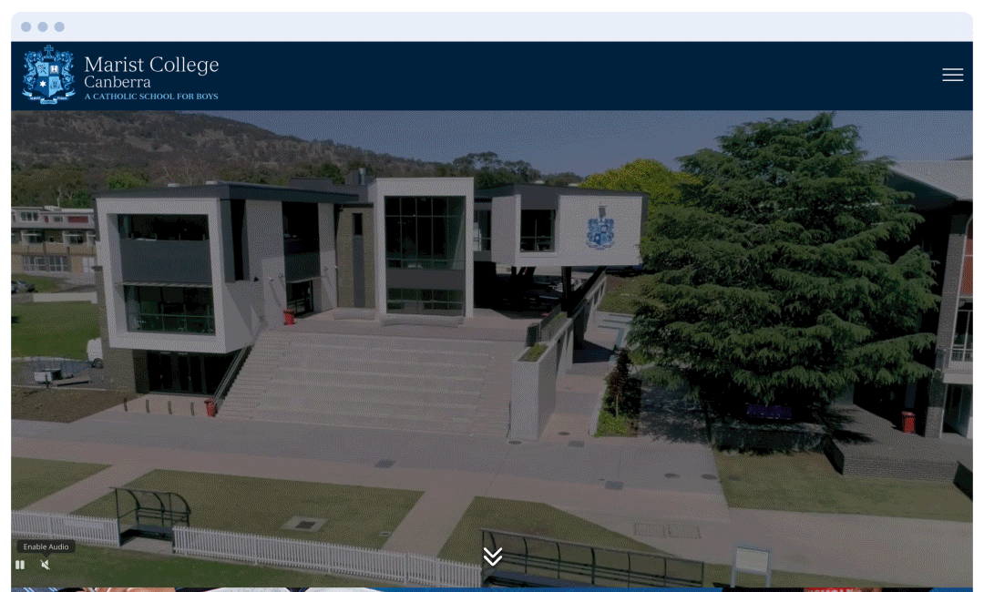
The first thing you will notice when you land on the Marist College website is a subtle bouncing arrow, encouraging visitors to scroll down to more content below. In the next block, you’ll notice a design technique called parallax scrolling. This involves background elements moving at a slower rate to the foreground elements. The purpose of this technique is to create a 3D effect as visitors scroll, providing a subtle element of depth. As visitors scroll further down the webpage, they’ll experience various micro-interactions that help to create a richer and more engaging user experience (UX).
Interactive scrolling
Another nifty way motion can be used is when scrolling to allow blocks of content to smoothly appear in view as visitors scroll up, down, or sideways. This web design technique provides a little more movement and interest while leading visitors through the website. Did you know that interactive scrolling can also boost time spent on the page by adding stimulation and curiosity? We find this works particularly well if your school has a longer homepage that requires visitors to do a fair amount of scrolling.
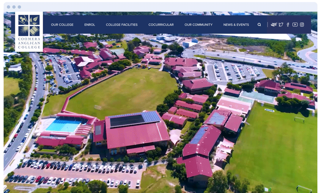
If we take a look at the Coomera Anglican College website, visitors are immediately drawn to the moving video content. Video can be an engaging way to capture attention and showcase your school. Once visitors begin scrolling, headings and elements come into view with gentle animations. Here we can see hovering image blocks that bring an overlay into view, further adding personality to the website. St Joseph’s Nudgee College is another great example of how interactive scrolling can bring a website to life.
Page and navigation transitions
Is there anything worse than a jarring page transition? Motion can be a great way to ease the transition between web pages. Though they may be subtle, these animations can signal the direction visitors move within your website navigation or page structure, creating hierarchy and a positive user experience. Trust us, this matters! When a users’ experience is interrupted, the chances of them leaving your website increase. Often this occurs when a new page takes too long to load – page transitions can help to maintain visitor attention as the new page loads.
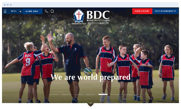
Over on the Bishop Druitt College website, you’ll notice that both desktop and mobile navigation is designed using a subtle slide animation as the menu comes into view. When clicking on a menu item, another slide animation appears, indicating the visitor is moving deeper within the navigation. Upon entering a new page, the content loads with a slight delay, and a slide animation creating a nice transition between the current and the loading page.
Website pop-ups
Finally, we have website pop-ups! A tried and tested technique, pop-ups are an effective way to use motion and create user engagement. Primarily geared toward a specific goal, pop-ups are commonly used to promote open enrollments, upcoming events, or tour bookings. On the German European School Singapore website, visitors are immediately greeted by a pop-up to encourage registrations for their Open House. Just like animation, there’s a balance that needs to be achieved when using pop-ups. To avoid annoying visitors, the pop-up doesn’t appear again until the site is opened in a different browser. By exploring the elements on the site, you’ll notice plenty of different hover effects and micro-interactions, making the site come to life and engage with its audience.
Summary
So what have we learned about motion design?
Motion design is extremely versatile and comes in many different shapes and forms, though the most common are; hover effects, interactive scrolling, navigation transitions, and website pop-ups. While effective, hovers and animations should be used subtly to achieve the best results aesthetically and avoid distraction.
To learn more about adding motion to your website or getting started with a new website project talk to our friendly sales team today – we’d love to learn more about your goals.
If you liked this post, check out the previous edition of this series: 5 Powerful Ways to Use Microsites.